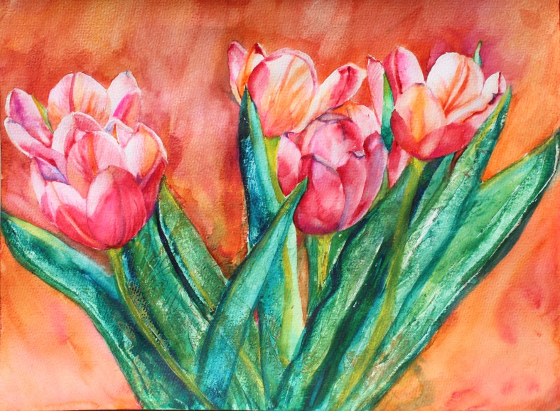
Today is a special day in the UK. Bright and cheerful are these tulips…to all the Mums Happy Mother’s Day !

Today is a special day in the UK. Bright and cheerful are these tulips…to all the Mums Happy Mother’s Day !

Light and flowers are very much the theme at the moment with the beginning of spring.
I used salt to give a sparkling effect at the top right hand side just to give more shine in the picture. Daffodils are great for their graphic contour and I like the sharpness of their forms.
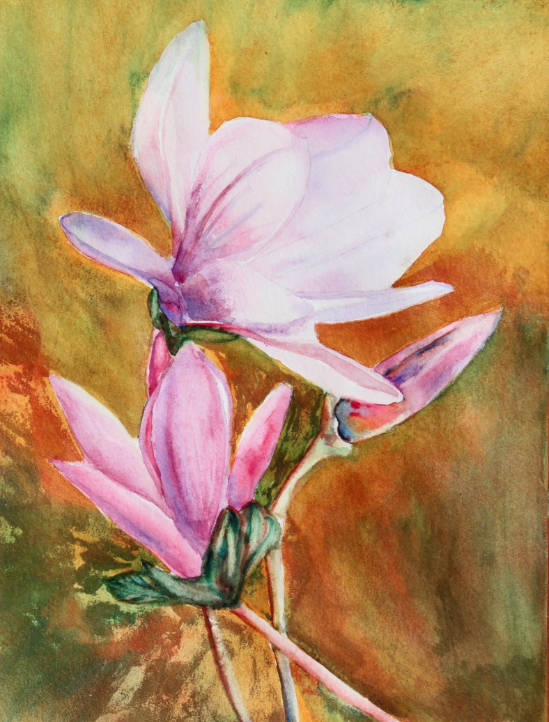
Magnolia trees are blossoming everywhere at the moment. It is a joy to see them every spring. I chose to do a very strong coloured background to give more depth to the picture.These flowers are very solid looking and they last for a long time for our greater pleasure. They are supposed to have a lemony scent but when you approach them, it is not really what comes first….

Just a few bits and pieces from the kitchen and my lovely little ceramic bird which is called an ocarina with which you can play tunes (hence the holes). I set this still life on a kitchen towel next to the window for maximum light.I showed my painting to Marina Kulik who is the watercolour teacher at the Hangar art centre (near Grasse) and she advised me to put more purple colours into the shadows for a greater impact and the result is that the objects certainly stand out…..Very effective… Thanks Marina !
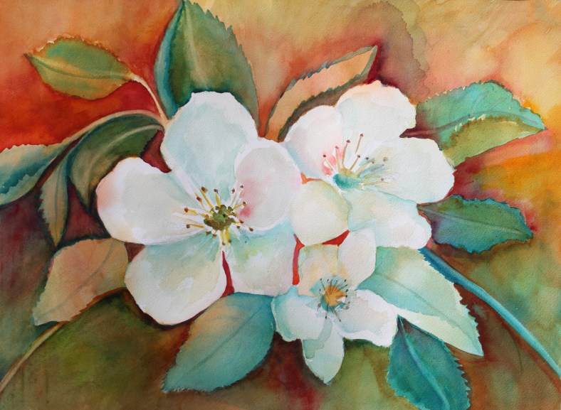
White blossoms have always had a magical appeal, so pure and so fragile at the same time. White blossoms don’t stay long and we have to make the most of them while they last. I had fun using warm colours to give the impression of first warm sun rays and a feeling of glorious days to come.The leaves appeared as negative shapes which I transformed into plausible features in this painting.

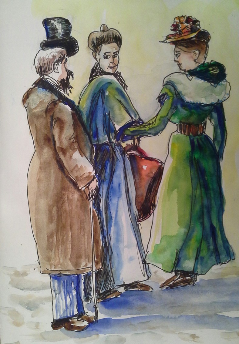
Last weekend we were in Paris. We went to the Palais Chaillot opposite the Eiffel tower to see an exhibition about Art Nouveau, but when we got there, we were told that the exhibition had been on 3 years ago…Big disappointment…. as on the internet the year of the advertised exhibition was not mentioned ! So as we were there, standing in front of ” la Cité de l’Architecture “, we got in to discover an amazing building with high ceilings and a fantastic view of the Eiffel tower.The figure standing in the foreground is me looking out of the window and admiring the amazing view well worth the trouble of getting to the wrong exhibition ! Plus the reflected light from the windows made an interesting subject for the painting.What you see on the walls and the right hand side are replica of pieces of masonry made of plaster.
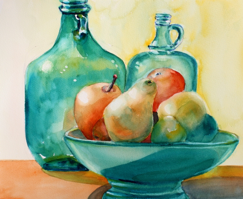
A very classical theme done in a modern style . I was inspired by the picture taken of a still life set up at the Hangar art centre (near Grasse) by Pim the art teacher. It was originally destined to be used during a drawing class. I approached it as a set of objects with bright and transparent colours. The light shining through was the real subject for me.
From my sketchbook, ink drawing with wash of a Paris scene in the olden days inspired by a black and white vintage photo.
 It is my sister’s birthday and I have decided to paint a special card for her : I picked up a watercolour bloc 23×30, 5 cm 300g/m2 and painted on half the page so I can fold it into 2, thus creating a standing card. I will do some calligraphy inside with the brush and will make it original and unique. I used lots of water to obtain that loose effect. I prefered fruit to flowers they are more juicy looking which makes perfect for the watery look.
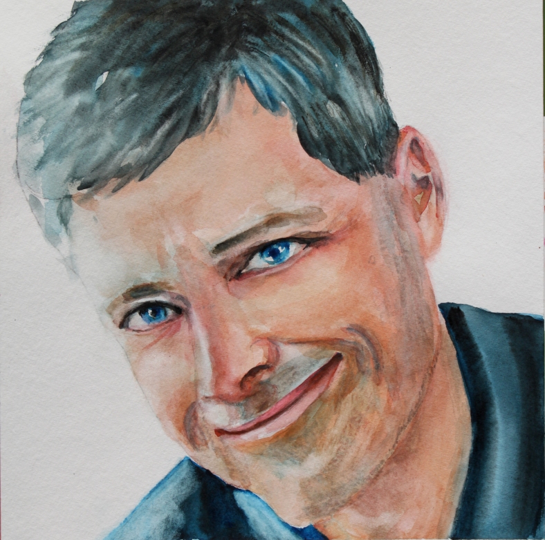
I was inspired to paint a portrait of Charlie who is the creator of an online community of artists called #WorldWatercolourGroup . Artists can share their work and be part of a community of kindred spirits. For me, it is a joy to look at the work of so many amazing, talented artists. It is always uplifting to read comments of encouragement or advice from others. Doodlewash.com is Charlie’s blog name where he provides a new art challenge regularly where everybody can join in if they feel inspired to do so. I had the honour to be featured as a guest artist in his blog in 2016. I am very grateful for all the work Charlie ,himself a talented artist,does and this group would not be so successful without his commitment and will to share his passion for watercolours.
This portrait was done on a paper called Bamboo from Hahnemühle for mixed media 265 g/m2 125 lbs 24 X 32 cm 9,4 X 12,6 in. It is very strong and great for portraits as it is easy to lift the paint. The grain is equivalent to a cold pressed watercolour paper with a good tooth. The only drawback is this paper doesn’t take very well masking tape and tends to rip….But overall, it is a good paper to work with and I will buy some more in the future.
